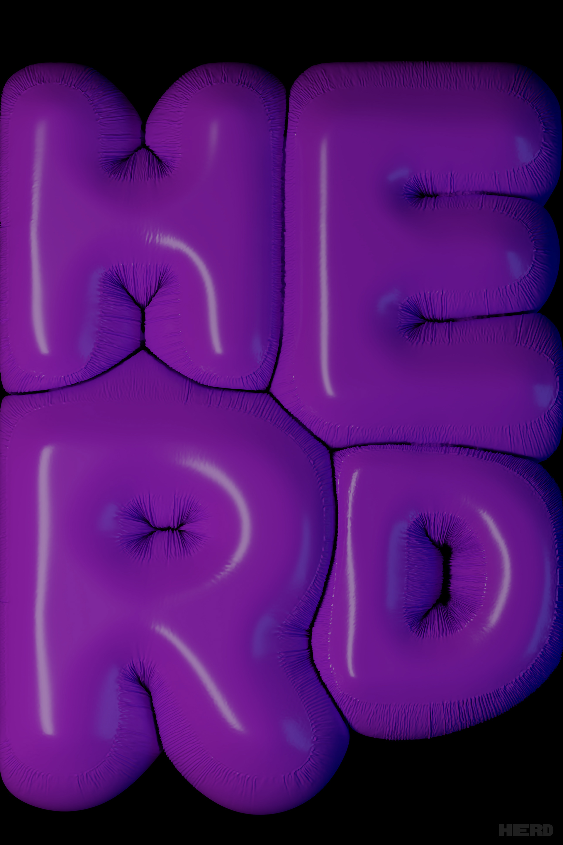
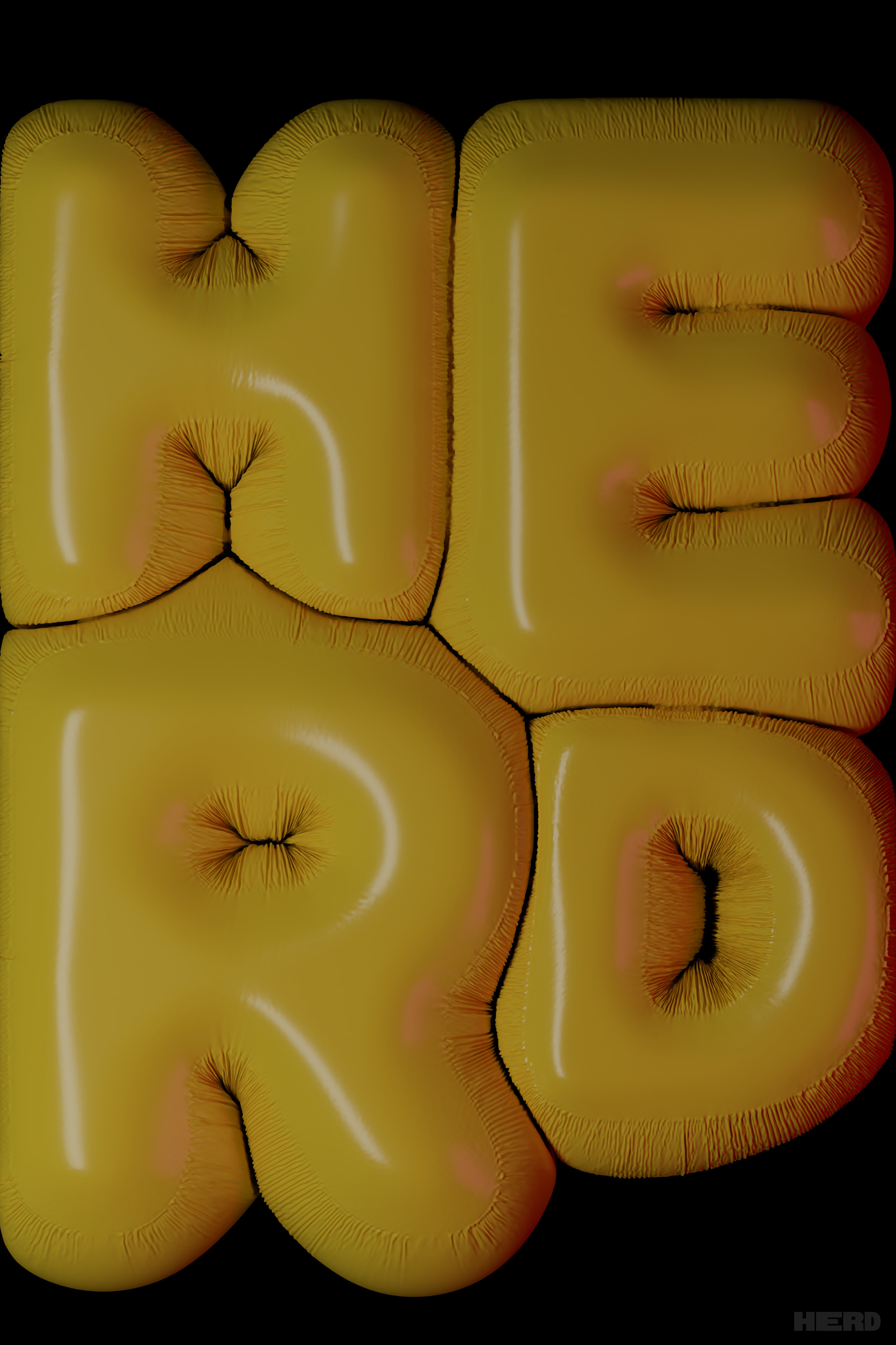
HERD
Group Magazine Project | Fall 2022
HERD is the result of a group project including myself and 4 other students. Each of us was given a role for the magazine as well as being tasked with designing 4 articles and 4 ads. Our magazine was themed around entertainment, specifically TV, Film, and Music.
Click any image to enlarge
COVER
I photographed and created our cover as well as our logo. The cover references one of our articles about HBO MAX deleting original content from their platform by showing a DVD being shattered.
ARTICLES
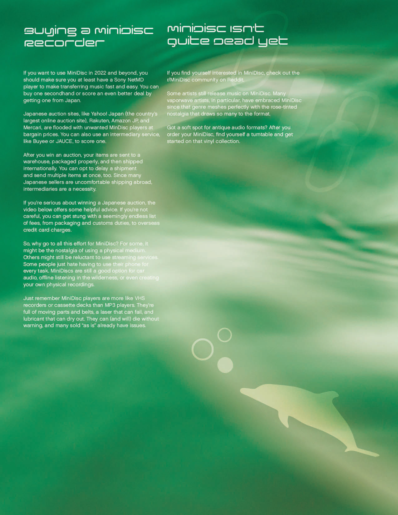
REMEMBER MINIDISC?
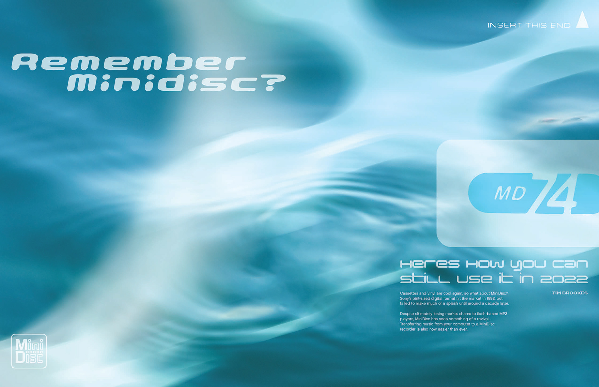
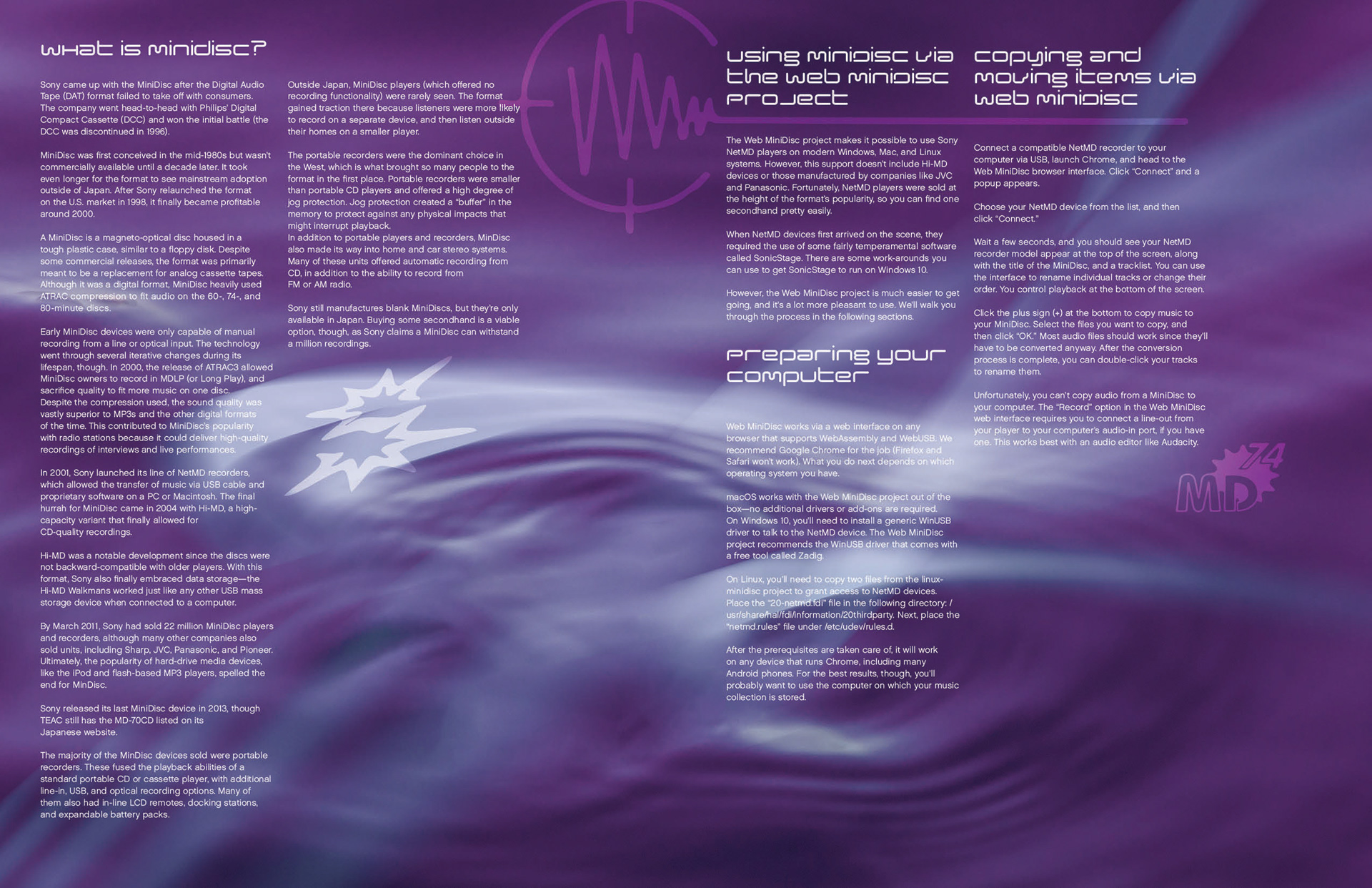
An article about the early 2000s media platform minidisc, and how you can still use it. MiniDisc was a physical music format that came around in the early 00s to compete with CDs and Cassettes. My goal was to mimic a specific aesthetic that some technology ads of time period used, which often had white text and glowing white effects on flowing water, blue skies or other abstract backgrounds. The discs usually came with graphics and logos on them which I included throughout, and the color choices were inspired by the clear colorful plastic the discs were incased in.
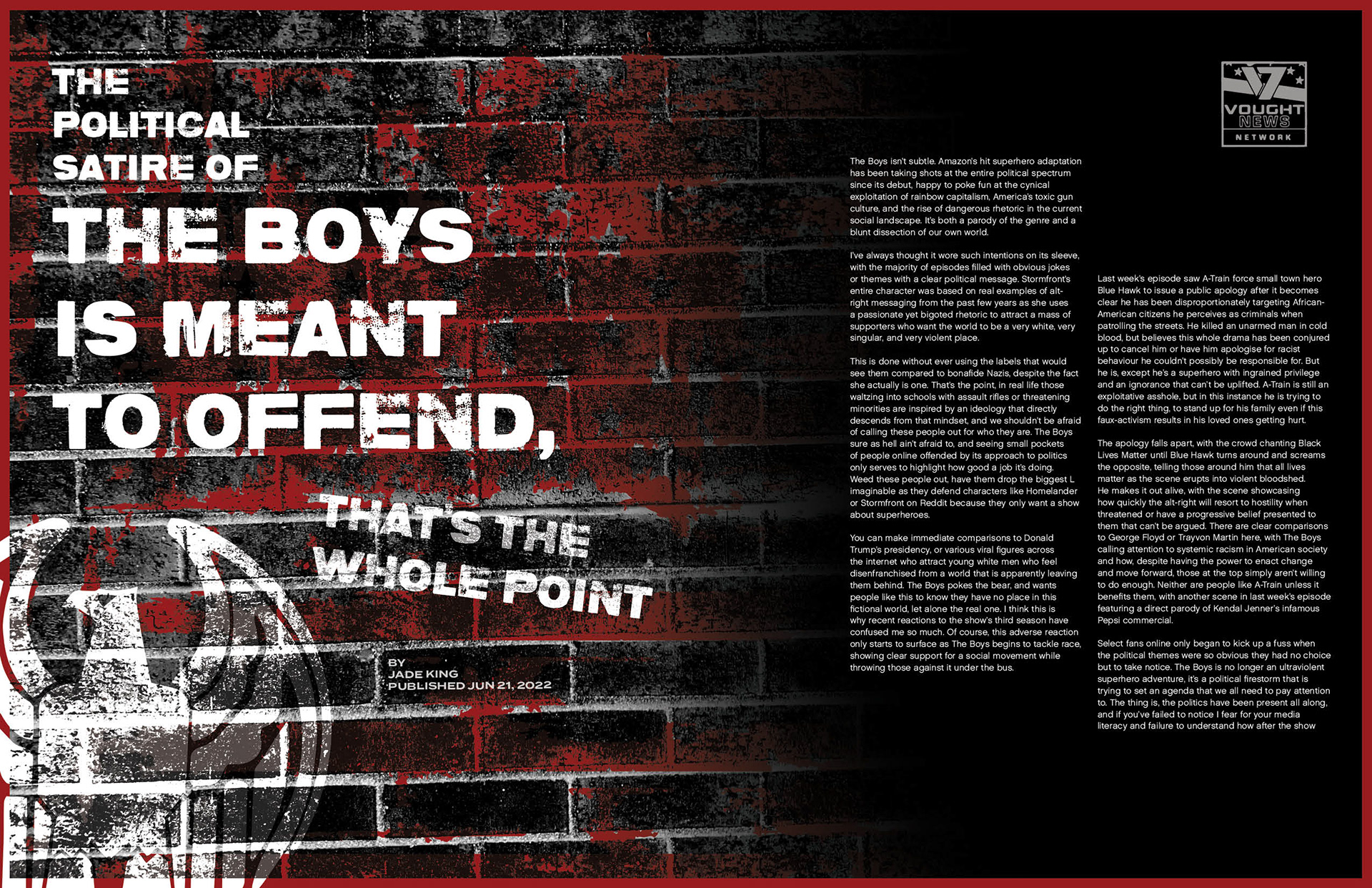
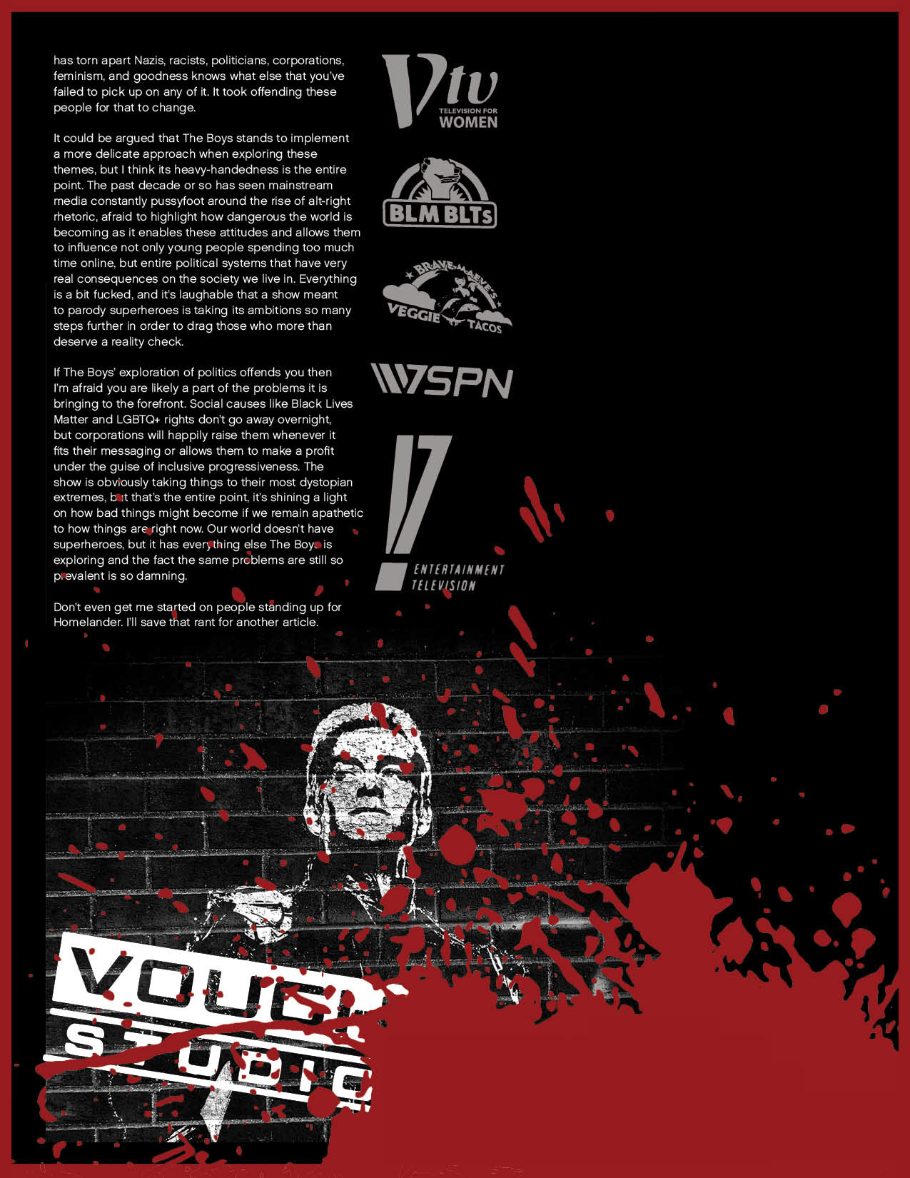
THE BOYS
The Boys is a show on Amazon Prime that parodies corporate media and the tropes of superhero movies. In the show the company Vought has a monopoly on almost everything in the country, including the production of superheros. Since the article is about the political satire of the show, I sprinkled logos of the parody Vought companies throughout the article. For the look of the article I grabbed inspiration from the style The Boys advertisements use which incorporate spray paint art and a black, white and red color scheme. The show can be very gory at times, so the blood splat on the last page is meant to reference that.
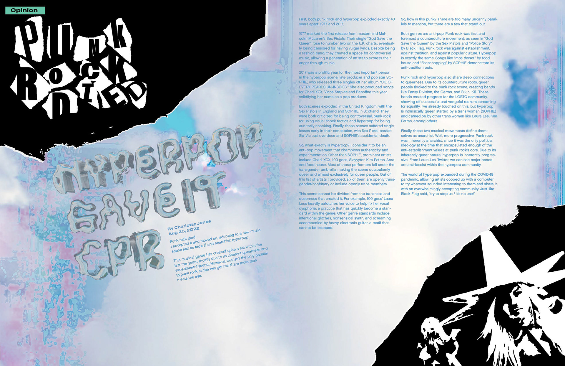
PUNK ROCK & HYPERPOP
Hyperpop is a music genre that reached its peak around the end of 2020. I chose this article because I thought the contrast between punk rock and hyperpop aesthetics would be interesting to represent visually. A lot of the design around hyperpop is meant to be overwhelming, chaotic and colorful so I tried to capture that using glitchy colorful backgrounds and clouds, as both things I’ve seen in other hyperpop related design. I used ripped paper and simple black and white for the punk rock parts because a lot of punk rock inspired designs I found used only 1 color and had rough paper elements. The font choice for the hyperpop half of the title came from the hyperpop producer Sophie who pioneered the genre and always used it for her work. 3D rendered chrome objects and text are also a very popular element of the genre so I included that in the title as well.
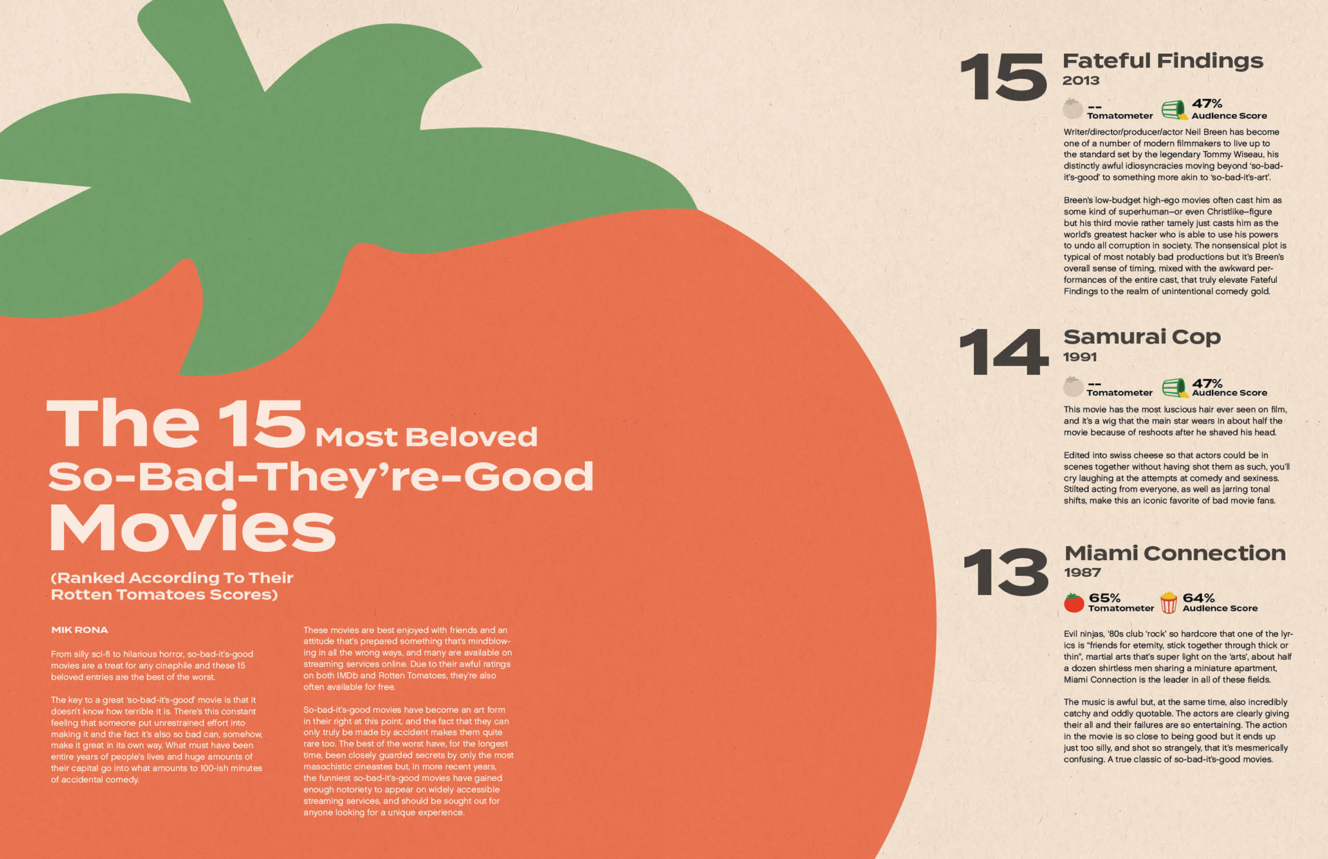
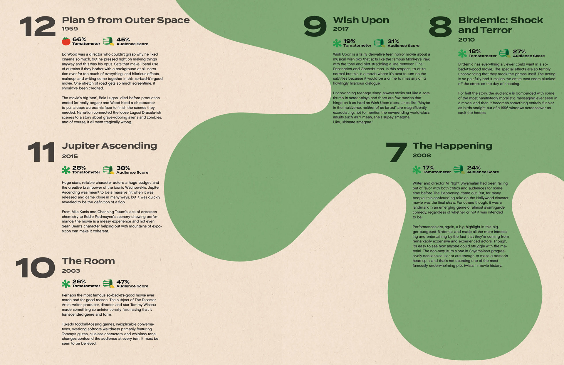
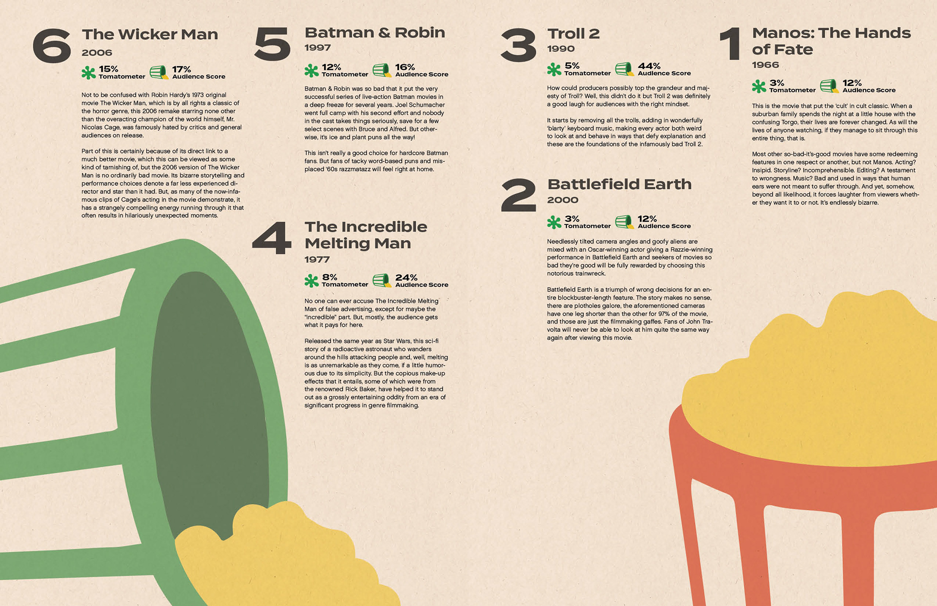
15 MOVIES
An article listing the funniest so-bad-they're-good movies, according to their score on Rotten Tomatoes. Imagery comes from the Rotten Tomatoes website.
ADs
NIKE
For the Nike Ad I created a collaboration between Nike and Back To The Future because my shoes are often compared to the main character, Marty Mcfly. I took a photo of my shoe and made it look like it was time traveling the same way the Delorean does in the movie.
ETSY
Etsy is known primarily for being a place to buy vintage clothes, but the website offers far more than just that. Since we’re a music, TV and movies magazine, I wanted to show that Etsy also sells vintage music players and albums as well. To further get the vintage feel across I used a big paragraph of type, which was common in old ads, and added a bit of grain to the whole thing.
MACBOOK PRO
Logic pro is a professional music producing software used by studios everywhere, made by Apple exclusively for Mac products. Since laptops are so powerful these days I wanted to show how with a newer Macbook you can essentially carry an entire music studio with you wherever you go. In apple fashion, I kept the ad very minimal and to the point.
SONY CAMERA
This Ad is meant to show how Sony mirrorless cameras are so good at shooting 4k footage that you could film an entire movie on them. I wanted to make a reference to a movie within the Ad so I rendered a photo of Herbie using the camera mode in Gran Turismo, a game made by Sony where the camera mode is based entirely off of Sony Alpha cameras.
OTHER
As well as doing my assigned work I also created a subscription page for our magazine, collaborated on stickers, and made a poster.
SUBSCRIPTION PAGE
A page advertising monthly prices and the yearly subscription for the magazine.
STICKERS
Stickers found inside our magazine. I created the simple sheep logo, the main logo, and the alternative logo.
POSTERS
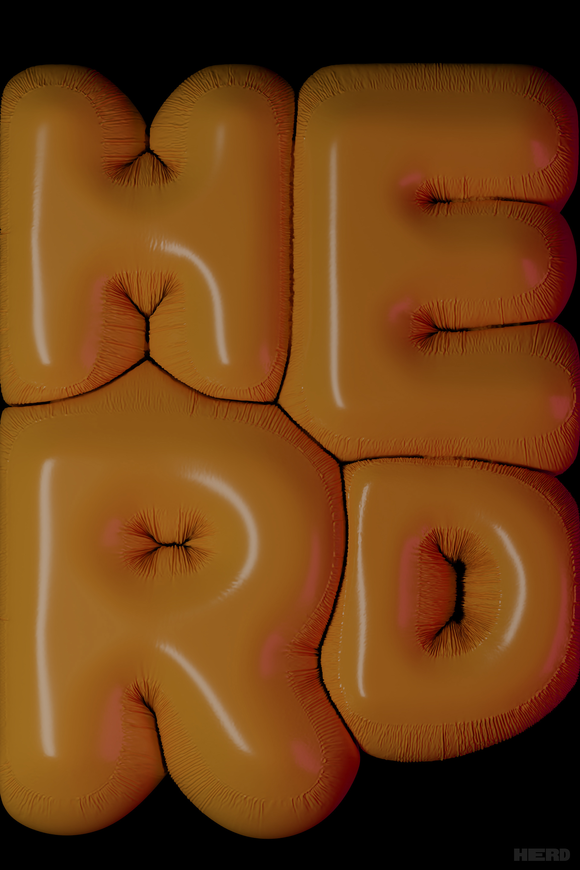
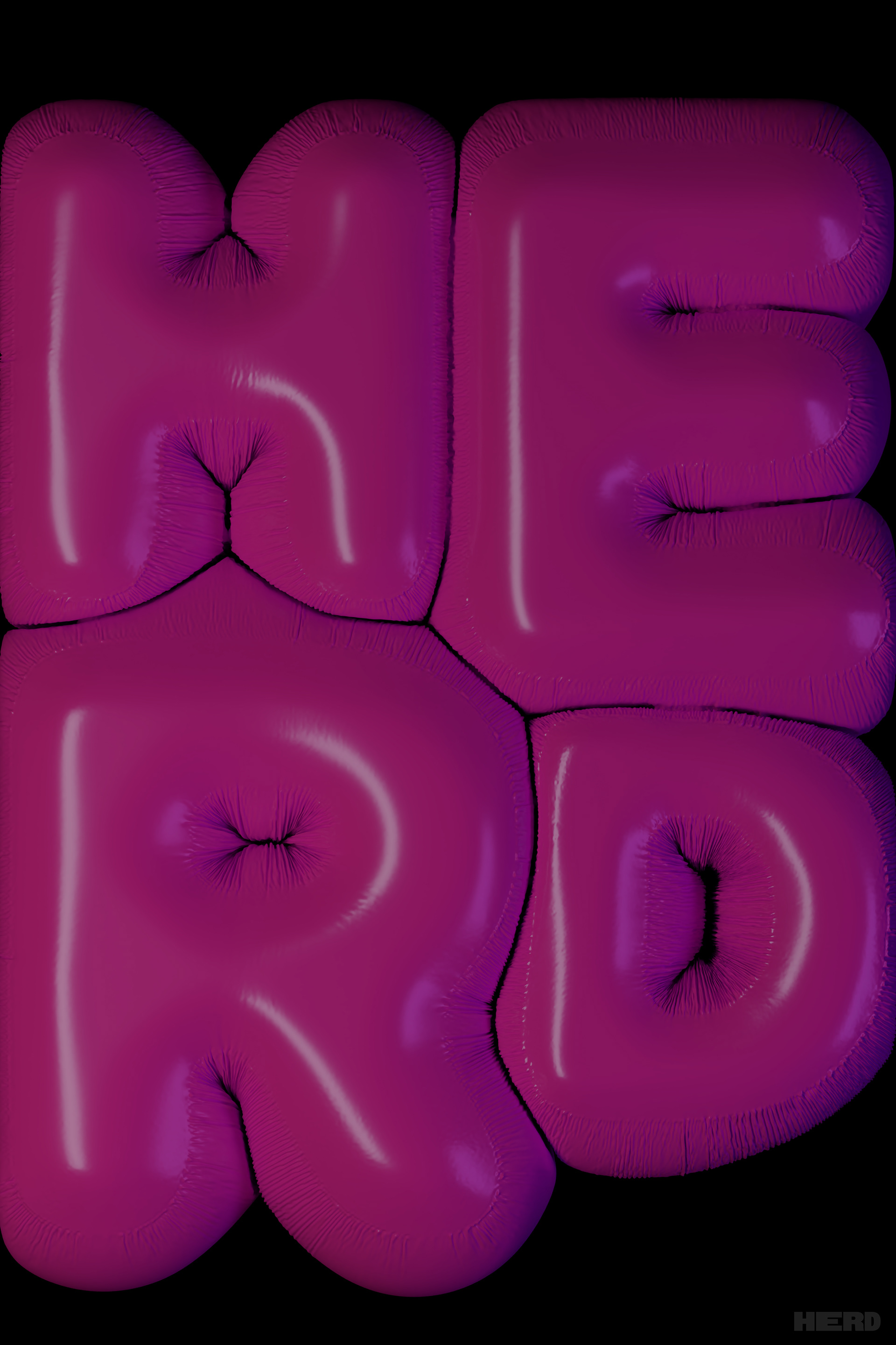
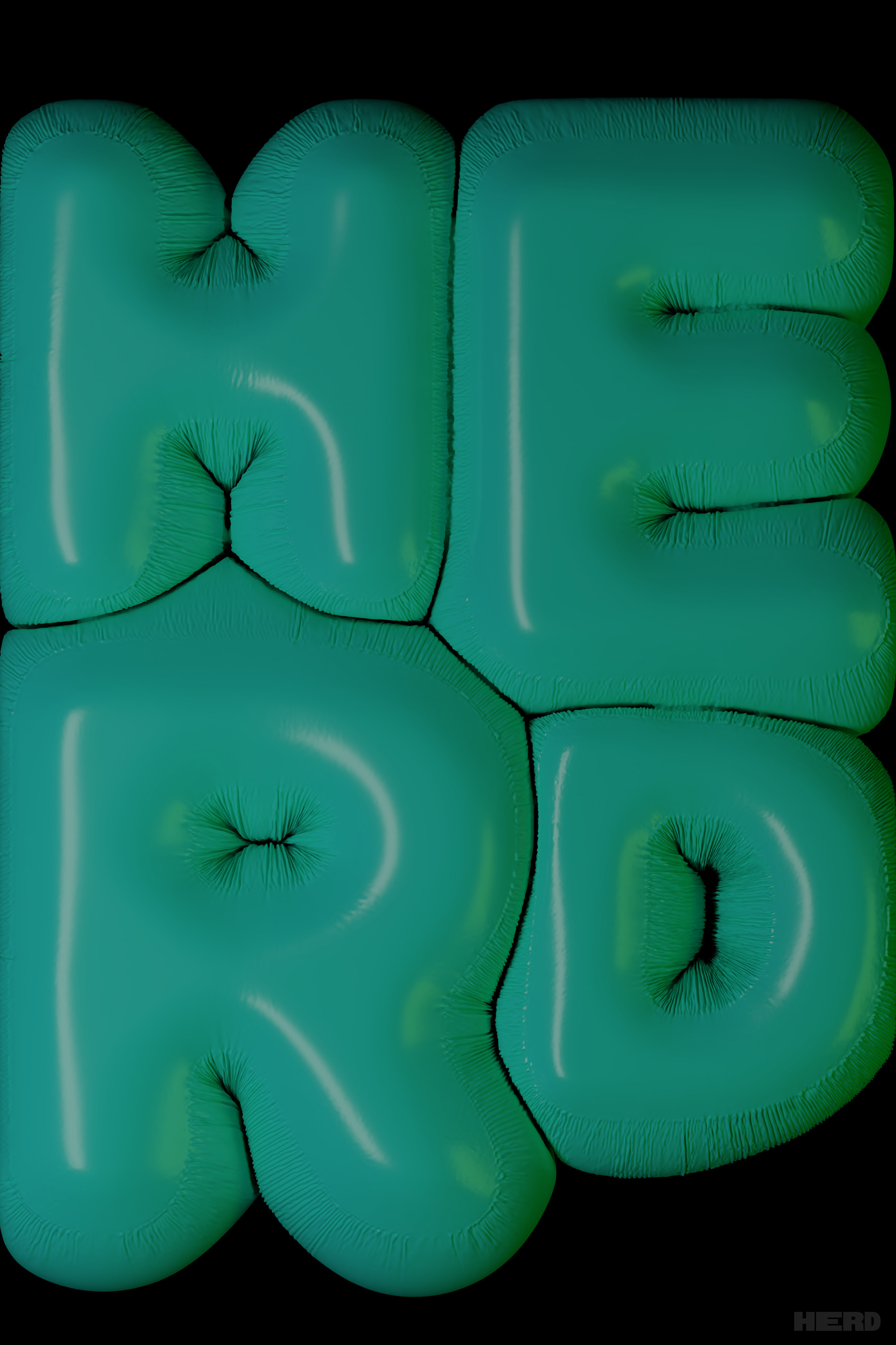
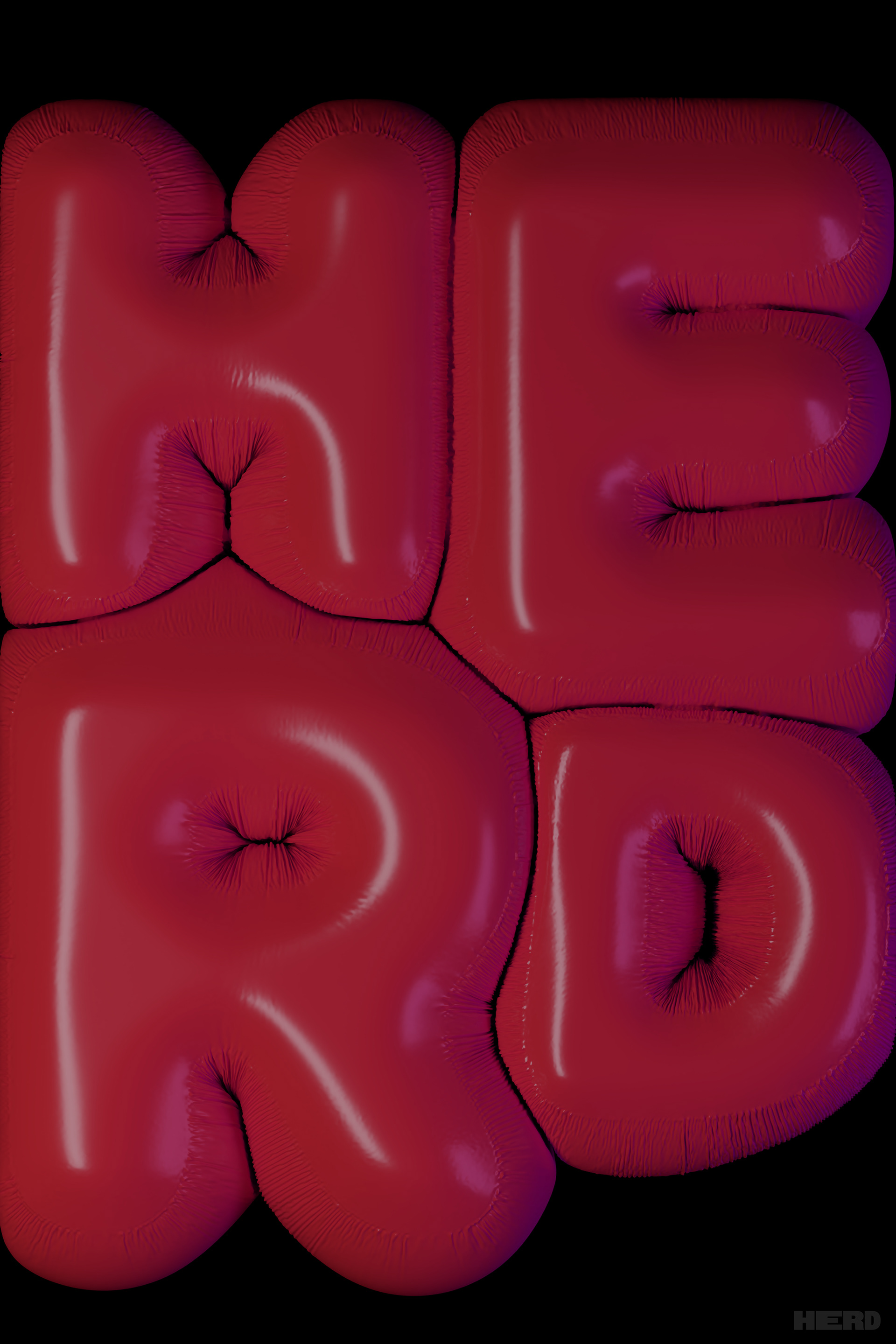
A poster that would be folded inside our magazine that I created in blender. Each copy of the magazine would get 1 of the 7 different color options.
